The physicist, as a gentleman and a scholar, who, in his leisure, pursues physics as both vocation and hobby, is an endangered species, though they once were endemic. Classic examples come from the turn of the last century, as Rayleigh and de Broglie and Raman built their own laboratories to follow their own ideas. These were giants in their fields. But there are also many quiet geniuses, enthralled with the life of ideas and the society of scientists, working into the late hours, following the paths that lead them forward through complex concepts and abstract mathematics as a labor of love.
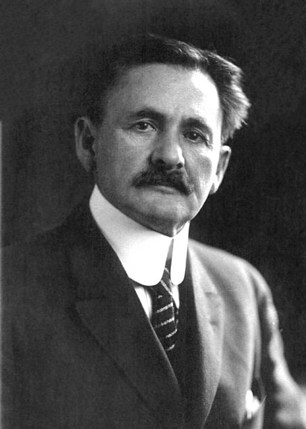
One of these quiet geniuses, of late, was a colleague of mine and a friend, Anant K. Ramdas. He was the last PhD student of the Nobel Prize Laureate, C. V. Raman, and he may have been the last of his kind as a gentleman and a scholar physicist.
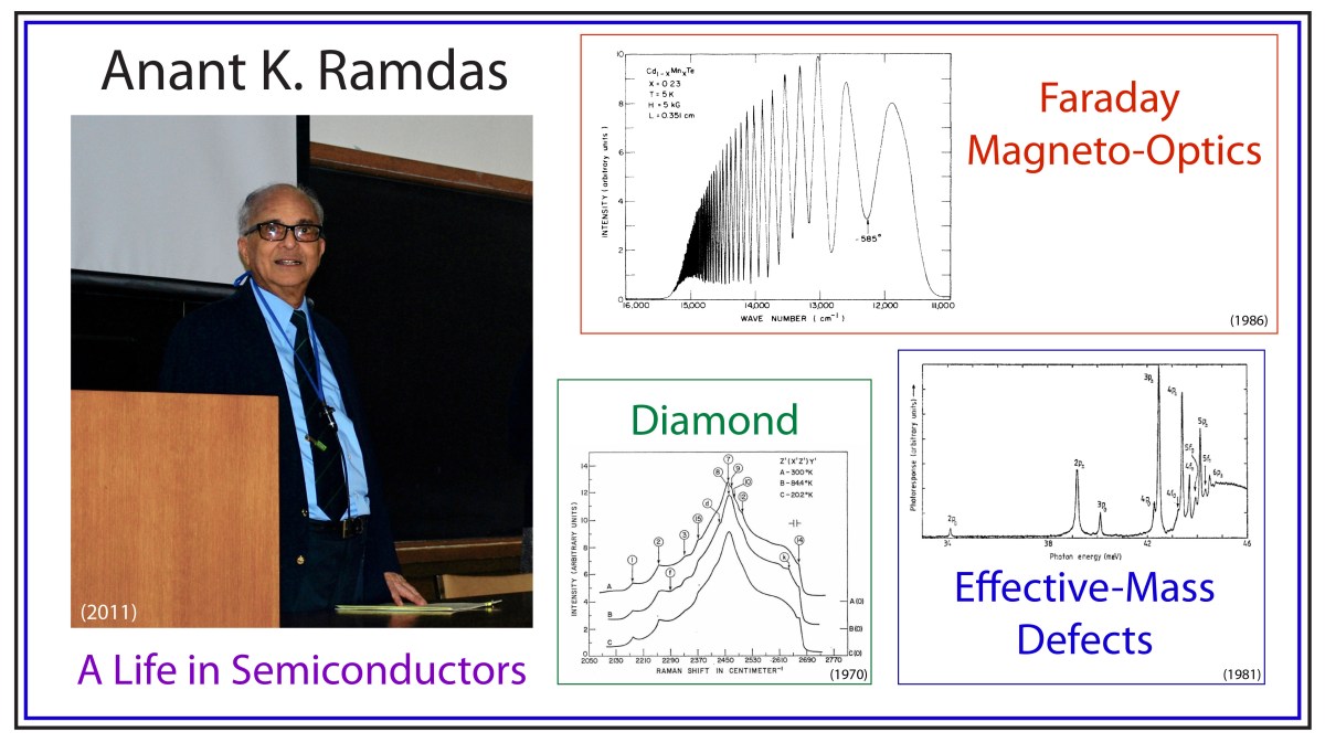
Anant K. Ramdas
Anant Ramdas was born in May, 1930, in Pune, India, not far from the megalopolis of Mumbai when it had just over a million inhabitants (the number is over 22 million today, nearly a hundred years later). His father, Lakshminarayanapuram A. Ramdas, was a scientist, a meteorologist who had studied under C. V. Raman at the University of Calcutta. Raman won the Nobel Prize in Physics the same year that Anant Ramdas was born.
Ramdas received his BS in Physics from the University of Pune in 1950, then followed in his father’s footsteps by studying for his MS (1953) and PhD (1956) degrees in Physics under Raman, who had established the Raman Institute in Bangalore, India.
While facing the decision, after his graduation, on what to do and where to go, Ramdas read a review article published by Prof. H. Y. Fan of Purdue University on infrared spectroscopy of semiconductors. After corresponding with Fan, and with the Purdue Physics department head, Prof. Karl Lark-Horowitz, Ramdas decided to accept the offer of a research associate (a post-doc position), and he prepared to leave India.
Within only a few months, he met and married his wife, Vasanti, and they hopped on a propeller plane to London that stopped along the way in Cairo, Beirut, Lebanon, and Paris before arriving in London. From there, they caught a cargo ship making a two-week passage across the Atlantic, after stopping at ports in France and Portugal. In New York City, they took a train to Chicago, getting off during a brief stop in the little corn-town of Lafayette, Indiana, home of Purdue University. It was 1956, and Anant and Vasanti were, ironically, the first Indians that some people in the Indiana town had ever seen.
Semiconductor Physics at Purdue
Semiconductors became the ascendent electronic material during the Second World War when it was discovered that their electrical properties were ideal for military radar applications. Many of the top physicists of the time worked at the “Rad Lab”, the Radiation Laboratory of MIT, and collaborations spread out across the US, including to the Physics Department at Purdue University. Researchers at Purdue were especially good at growing the semiconductor Germanium, which was used in radar rectifiers. The research was overseen by Lark-Horowitz.
After the war, semiconductor research continued to be a top priority in the Purdue Physics department as groups around the world competed to find ways to use semiconductors instead of vacuum tubes for information and control. Friendly competition often meant the exchange of materials and samples, and sometime in early 1947, several Germanium samples were shipped to the group of Bardeen and Brattain at Bell Labs, where, several months later, they succeeded in making the first point contact transistor using Germanium (with some speculation today that it may have been with the samples sent from Purdue). It was a close thing. Ralph Bray, a professor at Purdue, had seen nonlinear current dependences in the Purdue-grown Germanium samples that were precursers of transistor action, but Bell made the announcement before Bray had a chance to take the next step. Lark-Horowitz (and Bray) never forgot how close Purdue had come to making the invention themselves [1].
In 1948, Lark-Horowitz hired H. Y. Fan, who had received his PhD at MIT in 1937 and had been teaching at Tsinghua University in China. Fan was an experimental physicist specializing in the infrared properties of semiconductors, and when Ramdas arrived at Purdue in 1956, he worked directly under Fan. They published their definitive work on the infrared absorption of irradiated silicon in 1959 [2].
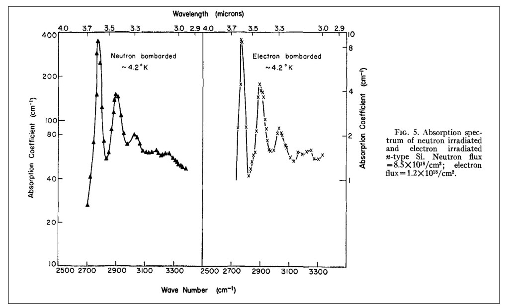
Absorption spectrum of “effective-mass” shallow defect levels in irradiated silicon.
One day, while Ramdas was working in Fan’s lab, Lark-Horowitz stopped by, as he was accustomed to do, and he casually asked if Ramdas would be interested in becoming a professor at Purdue. Ramdas of course said “Yes”, and Lark-Horowitz gave him the job on the spot. Ramdas was appointed as an assistant professor in 1960. These things were less formal in those days, and it was only later that Ramdas learned that Fan had already made a strong case for him.
The Golden Age of Physics
The period from 1960 to 2015, which spanned Ramdas’ career, start to finish, might be called “The Golden Age of Physics”.
This time span saw the completion of the Standard Model of particle physics with the theory of quarks (1964), the muon neutrino (1962), electro-weak unification (1968), quantum chromodynamics (1970s), the tau lepton (1975), the bottom quark (1977), the top quark (1995), the W and Z bosons (1983), the tau neutrino (2000), neutrino mass oscillations (2004), and of course capping it off with the detection of the Higgs boson (2012).
This was the period in solid state physics that saw the invention of the laser (1960), the quantum Hall effect (1980), the fractional quantum Hall effect (1982), scanning tunneling microscopy (1981), quasi-crystals (1982), high-temperature superconductors (1986), and graphene (2005).
This was also the period when astrophysics witnessed the discovery of the Cosmic Background Radiation (1964), the first black hole (1964), pulsars (1967), confirmation of dark matter (1970s), inflationary cosmology (1980s), Baryon Acoustic Oscillations (2005), and capping the era off with the detection of gravitational waves (2015).
The period from 1960 – 2015 stands out relative to the “first” Golden Age of Physics from 1900 – 1930 because this later phase is when the grand programs from early in the century were brought largely to completion.
But these are the macro-events of physics from 1960-2015. This era was also a Golden Age in the micro-events of the everyday lives of the physicists. It is this personal aspect where this later era surpassed the earlier era (when only a handful of physicists were making progress). In the later part of the century, small armies of physicists were advancing rapidly along all the frontiers at the same time, and doing it with the greatest focus.
This was when a single NSF grant could support a single physicist with several grad students and an undergraduate or two. The grants could be renewed with near certainty, as long as progress was made and papers were published. Renewal applications, in those days, were three pages. Contrast that to today when 25 pages need to be honed to perfection—and then the renewal rate is only about 10% (soon to be even lower with the recent budget cuts to science in the USA). In those earlier days, the certainty of success, and the absence of the burden of writing multiple long grant proposals, bred confidence to dispose of the conventional, to try anything new. In other words, the vast amount of time spent by physicists during this Golden Age was in the pursuit of physics, in the classroom and in the laboratory.
And this was the time when Anant Ramdas and his cohort—Sergio Rodriguez, Peter Fisher, Jacek Furdyna, Eugene Haller, the Chandrasekhar’s, Manuel Cardona, and the Dresselhaus’s—rode the wave of semiconductor physics when money was easy, good students were plentiful, and a vibrant intellectual community rallied around important problems.
Selected Topics of Research from Anant Ramdas
It is impossible to give justice to the breadth and depth of research performed by Anant over his career. So here is my selection of some of my favorite examples of his work:
Diamond
Anant had a life-long fascination for diamonds. As a rock and gem collector, he was fond of telling stories about the famous Cullinan diamond (weighed 1.3 pounds as a raw diamond at 3000 carats) and the blue Hope diamond (discovered in India). One of his earliest and most cited papers was on the Raman spectrum of Diamond [3], and he published several papers on his favorite color for diamonds—Blue [4]!
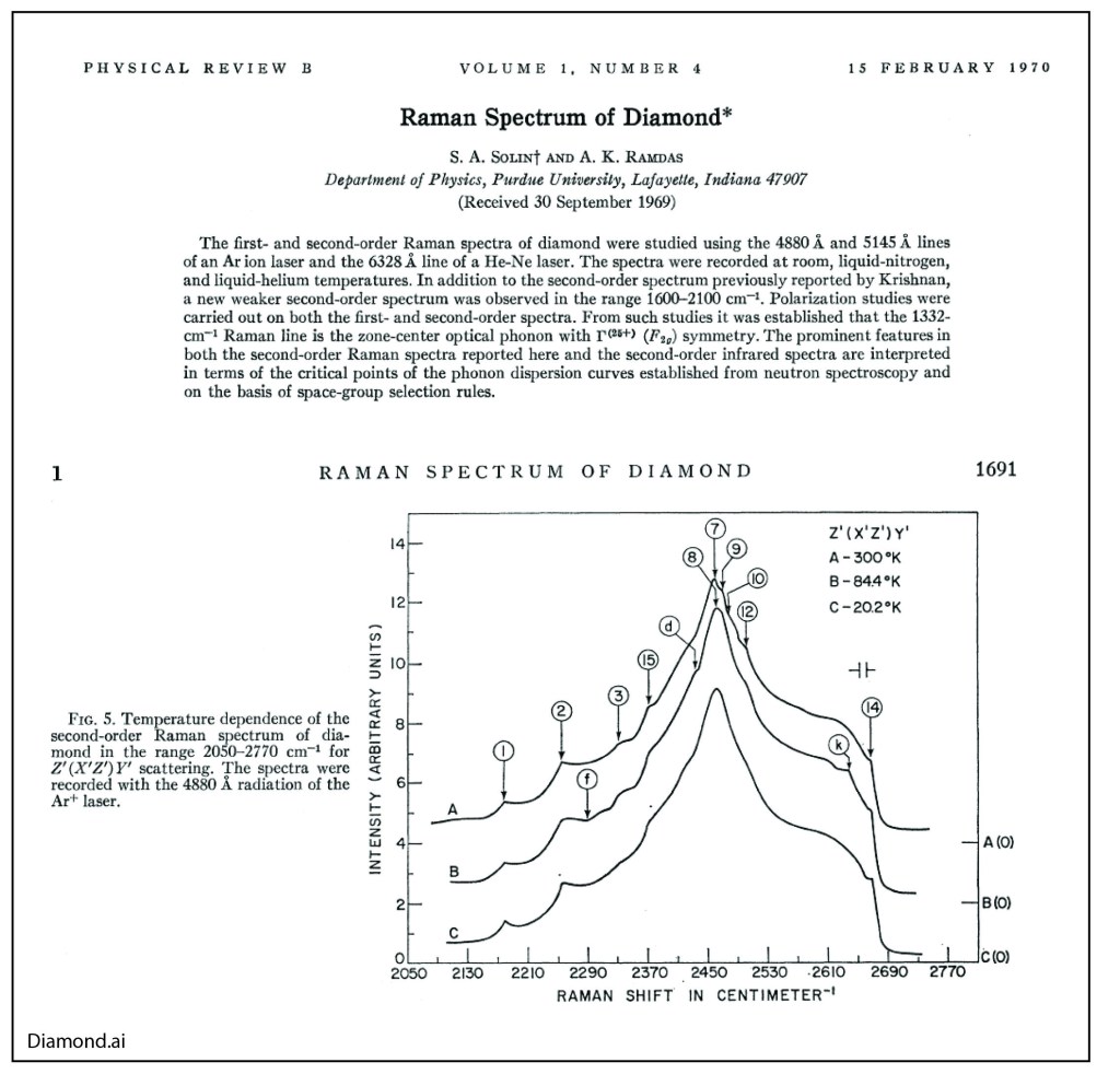
Raman Spectrum of Diamond.
His work on diamond helped endear Anant with the husband-wife team of Milly Dresselhaus and Gene Dresselhaus at MIT. Milly was the “Queen” of carbon, known for her work on graphite, carbon nanotubes and Fullerenes. Purdue had made an offer of an assistant professorship to Gene Dresselhaus when the two were looking for faculty positions after their post-docs at the University of Chicago, but Purdue would not give Milly a position (she was viewed as a “trailing” spouse). Anant was already at Purdue at that time and got to know both of them, maintaining a life-long friendship. Milly went on to become the president of the APS and was elected a member of the National Academy of Sciences, the National Academy of Engineering and the American Academy of Arts and Sciences.
Magneto-Optics
Purdue was a hot-bed of II-VI semiconductor research in the 1980’s, spearheaded by Jacek Furdyna. The substitution of the magnetic ion Mn for Zn, Cd or Hg created a unique class of highly magnetic semiconductors. Anant was the resident expert on the optical properties of the materials and collected one of the best examples of Giant Faraday Rotation [5].
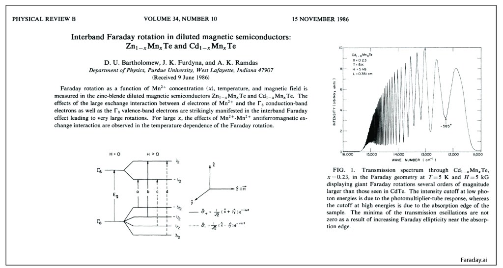
Giant Faraday Effect in CdMnTe
Anant and the Purdue team were the world leaders in the physics and materials science of diluted magnetic semiconductors.
Shallow Defects in Semiconductors
My own introduction to Anant was through his work on shallow effective-mass defect states in semiconductors. I was working towards my PhD with Eugene ‘Gene” Haller at Lawrence Berkeley Lab (LBL) in the early 1980’s, and Gene was an expert on the spectroscopy of the shallow levels in Germanium. My co-physics graduate student colleague was Joe Kahn, and the two of us were tasked with studying the review article that Anant had written with his long-time theoretical collaborator Sergio Rodriguez on the physics of effective-mass shallow defects in semiconductors [6]. We called it “The Bible”, and spent months studying it. Gene Haller’s principal technique was photothermal ionization spectroscopy (PTIS), and Joe was building the world’s finest PTIS instrument. Joe met Anant for dinner one night at the March meeting of the APS in 1986, and when he got back to the room, he waxed poetic about Anant for an hour. It was like he had met his hero. I don’t remember how I missed that dinner, so my personal introduction to Anant Ramdas would have to wait.
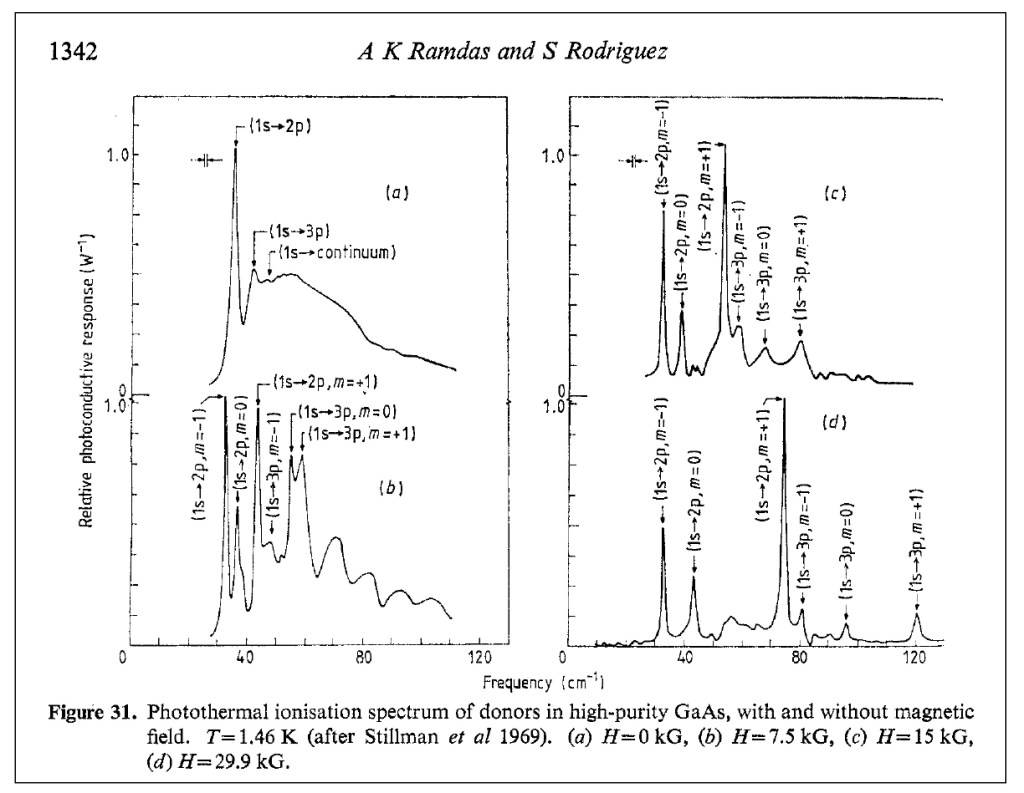
PTIS spectra of donors in GaAs
My own research went into deep-level transient spectroscopy (DLTS) working with Gene and his group theorist, Wladek Walukiewicz, where we discovered a universal pressure derivative in III-V semiconductors. This research led me to a post-doc position at Bell Labs under Alastair Glass and later to a faculty position at Purdue, where I did finally meet Anant, who became my long-time champion and mentor. But Joe had stayed with the shallow defects, and in particular defects that showed interesting dynamical properties, known as tunneling defects.
Dynamic Defects in Semiconductors
Dynamic defects in semiconductors are multicomponent defects (often involving vacancies or interstitial defects) in which one of the components tunnels quantum mechanically, or hops, rapidly on a time scale short compared to the measurement interaction time (electric dipole transition), so that the measurement sees increased symmetry compared to the instantaneous low-symmetry configuration of the defect.
Eugene Haller and his physics theory collaborator, Leo Falicov, were pioneers in tunneling defects related to hydrogen, building on earlier work by George Watkins who studied dynamical defects using EPR measurements. In my early days doing research under Eugene, we thought we had discovered a dynamical effect in FeB defects in silicon, and I spent two very interesting weeks at Lehigh University, visiting Watkins, to test out our idea, but it turned out to be a static effect. Later, Joe Kahn found that some of the early hydrogen defects in Germanium that Gene and Leo had proposed as dynamical defects were also, in fact, static. So the class of dynamical defects in semiconductors was actually shrinking over time rather than expanding. Joe did go on to find clear proof of a hydrogen-related dynamical defect in Germanium, saving the Haller-Falicov theory from the dust bin of Physics History.
In 2006 and in 2008, Ramdas was working on Oxygen-related defect complexes in CdSe when his student, G. Chen [7-8], discovered a temperature-induced symmetry raising. It showed clear evidence for a lower symmetry defect that converged into a higher symmetry mode at high temperatures, very much in agreement with the Haller-Falicov theory of dynamical symmetry raising.
At that time, I was developing my course notes for my textbook Introduction to Modern Dynamics, where some of the textbook problems in synchronization looked just like Anant’s data. Using a temperature-dependent coupling in a model of nonlinear (anharmonic) oscillators, I obtained the following fits (solid curves) to the Ramdas data (data points):
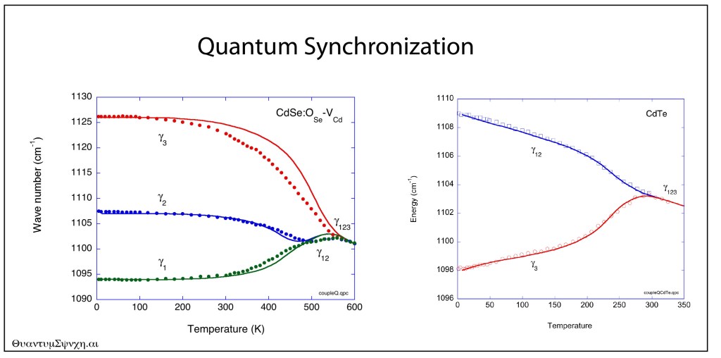
Quantum synchronization in CdSe and CdTe.
The fit looks too good to be a coincidence, and Anant and I debated on whether the Haller-Falicov theory, or a theory based on nonlinear synchronization, would be better descriptions of the obviously dynamical properties of these defects. Alas, Anant is now gone, and so are Gene and Leo, so I am the last one left thinking about these things.
Beyond the Golden Age?
Anant Ramdas was fortunate to have spent his career during the Golden Age of Physics, when the focus was on the science and on the physics, as healthy communities helped support one another in friendly competition. He was a gentleman scholar, an avid reader of books on history and philosophy, much of it (but not all) on the history and philosophy of physics. His “Coffee Club” at 9:30 AM every day in the Physics Department at Purdue was a must-not-miss event that was attended by all of the Old Guard as well as by myself, where the topics of conversation ran the gamut, presided over by Anant. He had his NSF grant, year after year (and a few others), and that was all he needed to delve into the mysteries of the physics of semiconductors.
Is that age over? Was Anant one of the last of that era? I can only imagine what he would say about the current war against science and against rationality raging across the USA right now, and the impending budget cuts to all the science institutes. He spent his career and life upholding the torch of enlightenment. Today, I fear he would be holding it in the dark. He passed away Thanksgiving, 2024.
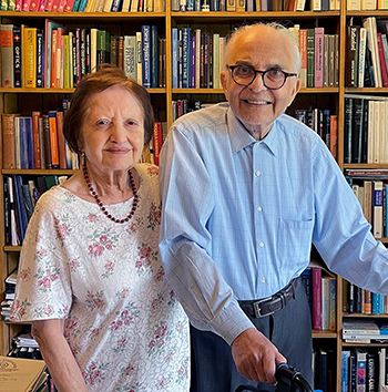
Vasanti and Anant, 2022.
References
[1] Ralph Bray, “A Case Study in Serendipity”, The Electrochemical Society, Interface, Spring 1997.
[2] H. Y. Fan and A. K. Ramdas, “INFRARED ABSORPTION AND PHOTOCONDUCTIVITY IN IRRADIATED SILICON,” Journal of Applied Physics, Article vol. 30, no. 8, pp. 1127-1134, 1959, doi: 10.1063/1.1735282.
[3] S. A. Solin and A. K. Ramdas, “RAMAN SPECTRUM OF DIAMOND,” Physical Review B, Article vol. 1, no. 4, pp. 1687-&, 1970, doi: 10.1103/PhysRevB.1.1687
[4] H. J. Kim, Z. Barticevic, A. K. Ramdas, S. Rodriguez, M. Grimsditch, and T. R. Anthony, “Zeeman effect of electronic Raman lines of accepters in elemental semiconductors: Boron in blue diamond,” Physical Review B, Article vol. 62, no. 12, pp. 8038-8052, Sep 2000, doi: 10.1103/PhysRevB.62.8038.
[5] D. U. Bartholomew, J. K. Furdyna, and A. K. Ramdas, “INTERBAND FARADAY-ROTATION IN DILUTED MAGNETIC SEMICONDUCTORS – ZN1-XMNXTE AND CD1-XMNXTE,” Physical Review B, Article vol. 34, no. 10, pp. 6943-6950, Nov 1986, doi: 10.1103/PhysRevB.34.6943.
[6] A. K. Ramdas and S. Rodriguez, “SPECTROSCOPY OF THE SOLID-STATE ANALOGS OF THE HYDROGEN-ATOM – DONORS AND ACCEPTORS IN SEMICONDUCTORS,” Reports on Progress in Physics, Review vol. 44, no. 12, pp. 1297-1387, 1981, doi: 10.1088/0034-4885/44/12/002
[7] G. Chen, I. Miotkowski, S. Rodriguez, and A. K. Ramdas, “Stoichiometry driven impurity configurations in compound semiconductors,” Physical Review Letters, Article vol. 96, no. 3, Jan 2006, Art no. 035508, doi: 10.1103/PhysRevLett.96.035508.
[8] G. Chen, J. S. Bhosale, I. Miotkowski, and A. K. Ramdas, “Spectroscopic Signatures of Novel Oxygen-Defect Complexes in Stoichiometrically Controlled CdSe,” Physical Review Letters, Article vol. 101, no. 19, Nov 2008, Art no. 195502, doi: 10.1103/PhysRevLett.101.195502.
Other Notable Papers:
[9] E. S. Oh, R. G. Alonso, I. Miotkowski, and A. K. Ramdas, “RAMAN-SCATTERING FROM VIBRATIONAL AND ELECTRONIC EXCITATIONS IN A II-VI QUATERNARY COMPOUND – CD1-X-YZNXMNYTE,” Physical Review B, Article vol. 45, no. 19, pp. 10934-10941, May 1992, doi: 10.1103/PhysRevB.45.10934.
[10] R. Vogelgesang, A. K. Ramdas, S. Rodriguez, M. Grimsditch, and T. R. Anthony, “Brillouin and Raman scattering in natural and isotopically controlled diamond,” Physical Review B, Article vol. 54, no. 6, pp. 3989-3999, Aug 1996, doi: 10.1103/PhysRevB.54.3989.
[11] M. H. Grimsditch and A. K. Ramdas, “BRILLOUIN-SCATTERING IN DIAMOND,” Physical Review B, Article vol. 11, no. 8, pp. 3139-3148, 1975, doi: 10.1103/PhysRevB.11.3139.
[12] E. S. Zouboulis, M. Grimsditch, A. K. Ramdas, and S. Rodriguez, “Temperature dependence of the elastic moduli of diamond: A Brillouin-scattering study,” Physical Review B, Article vol. 57, no. 5, pp. 2889-2896, Feb 1998, doi: 10.1103/PhysRevB.57.2889.
[13] A. K. Ramdas, S. Rodriguez, M. Grimsditch, T. R. Anthony, and W. F. Banholzer, “EFFECT OF ISOTOPIC CONSTITUTION OF DIAMOND ON ITS ELASTIC-CONSTANTS – C-13 DIAMOND, THE HARDEST KNOWN MATERIAL,” Physical Review Letters, Article vol. 71, no. 1, pp. 189-192, Jul 1993, doi: 10.1103/PhysRevLett.71.189.
.


.jpg)