Physics in the Age of Contagion: Part 4. Fifty Shades of Immunity to COVID-19

This is the fourth installment in a series of blogs on the population dynamics of COVID-19. In my first blog I looked at a bifurcation physics model that held the possibility (and hope) that with sufficient preventive action the pandemic could have died out and spared millions. That hope was in vain.

What will it be like to live with COVID-19 as a constant factor of modern life for years to come?

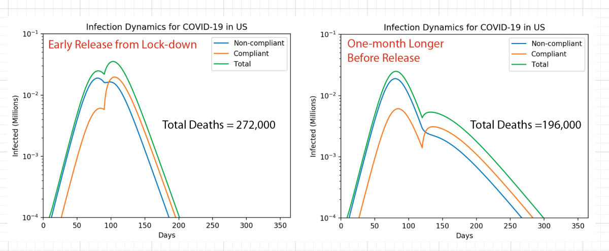
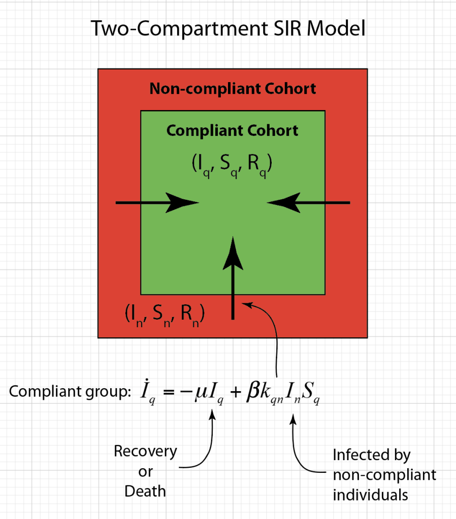
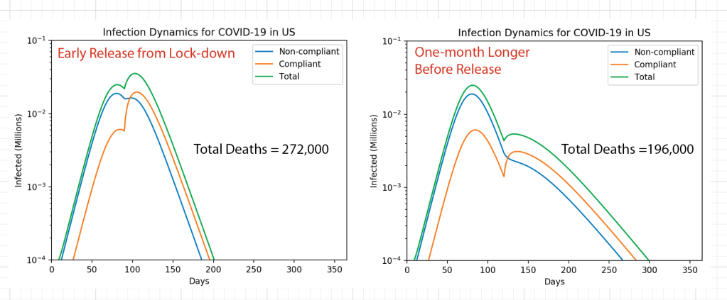
In my second blog I looked at a two-component population dynamics model that showed the importance of locking down and not emerging too soon. It predicted that waiting only a few extra weeks before opening could have saved tens of thousands of lives. Unfortunately, because states like Texas and Florida opened too soon and refused to mandate the wearing of masks, thousands of lives were lost.

In my third blog I looked at a network physics model that showed the importance of rapid testing and contact tracing to remove infected individuals to push the infection rate low — not only to flatten the curve, but to drive it down. While most of the developed world is succeeding in achieving this, the United States is not.

In this fourth blog, I am looking at a simple mean-field model that shows what it will be like to live with COVID-19 as a constant factor of modern life for years to come. This is what will happen if the period of immunity to the disease is short and people who recover from the disease can get it again. Then the disease will never go away and the world will need to learn to deal with it. How different that world will look from the one we had just a year ago will depend on the degree of immunity that is acquired after infection, how long a vaccine will provide protection before booster shots are needed, and how many people will get the vaccine or will refus.

SIRS for SARS

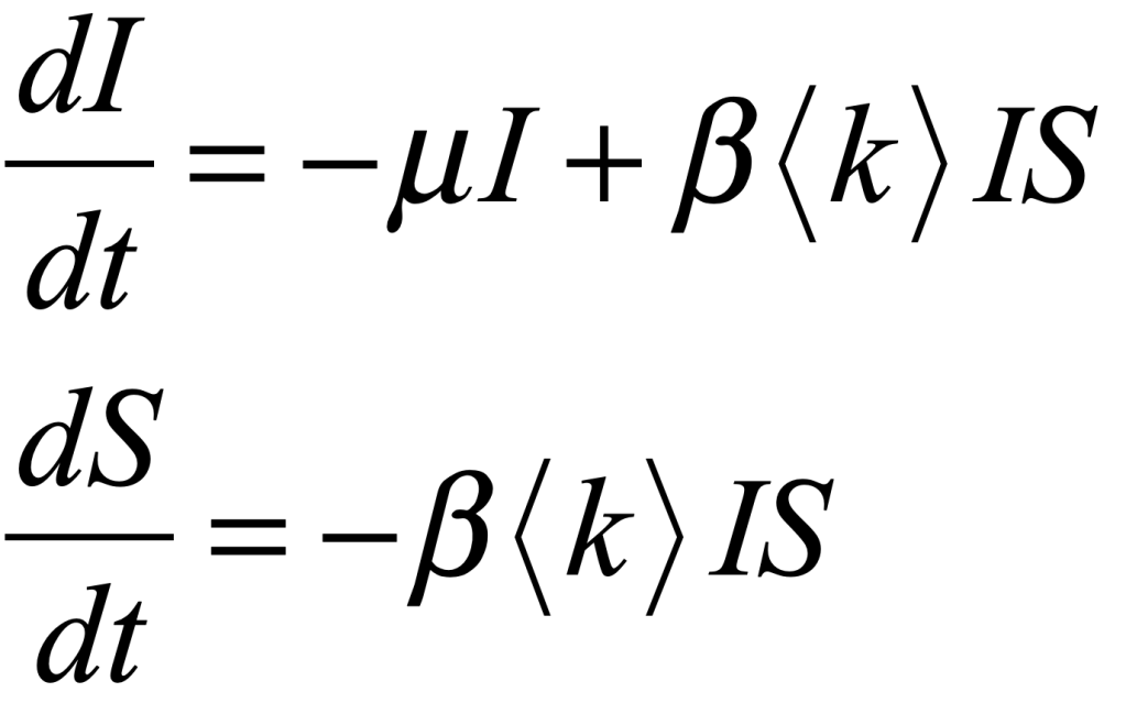
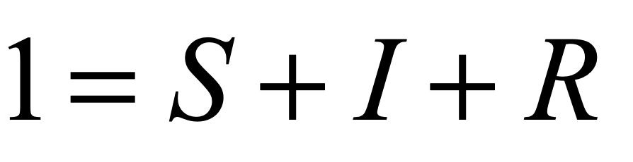
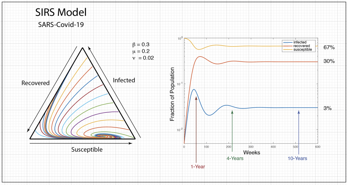
COVID-19 is a SARS corona virus known as SARS-CoV-2. SARS stands for Severe Acute Respiratory Syndrome. There is a simple and well-established mean-field model for an infectious disease like SARS that infects individuals, from which they recover, but after some lag period they become susceptible again. This is called the SIRS model, standing for Susceptible-Infected-Recovered-Susceptible. This model is similar to the SIS model of my first blog, but it now includes a mean lifetime for the acquired immunity, after an individual recovers from the infection and then becomes susceptible again. The bifurcation threshold is the same for the SIRS model as the SIS model, but with SIRS there is a constant susceptible population. The mathematical flow equations for this model are

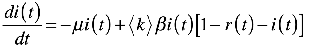
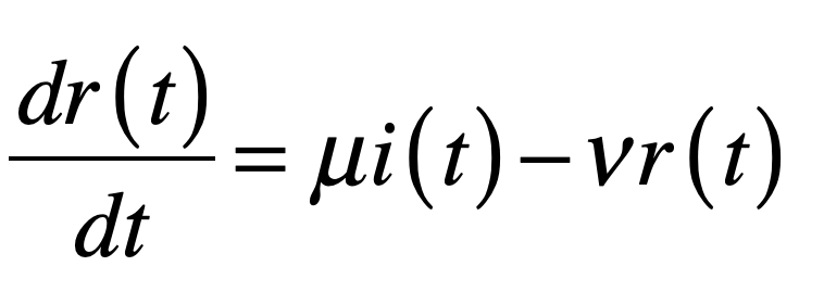
where i is the infected fraction, r is the recovered fraction, and 1 – i – r = s is the susceptible fraction. The infection rate for an individual who has k contacts is βk. The recovery rate is μ and the mean lifetime of acquired immunity after recovery is τlife = 1/ν. This model assumes that all individuals are equivalent (no predispositions) and there is no vaccine–only natural immunity that fades in time after recovery.

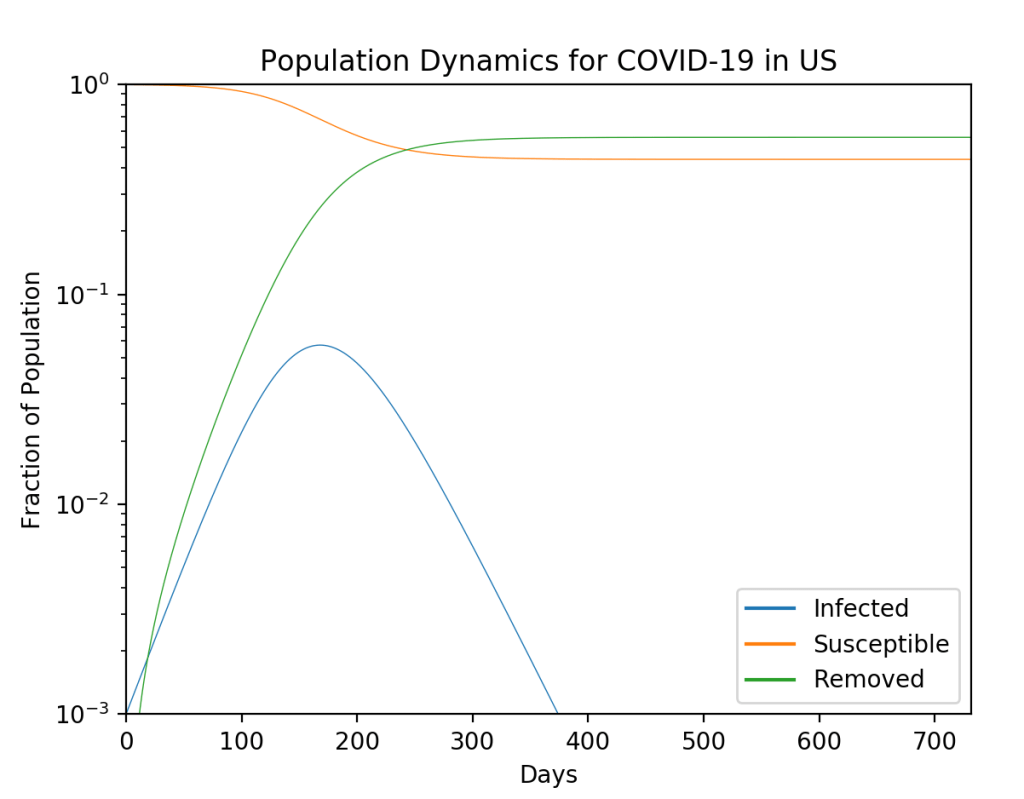
The population trajectories for this model are shown in Fig. 1. The figure on the left is a 3-simplex where every point in the triangle stands for a 3-tuple (i, r, s). Our own trajectory starts at the right bottom vertex and generates the green trajectory that spirals into the fixed point. The parameters are chosen to be roughly equivalent to what is known about the virus (but with big uncertainties in the model parameters). One of the key results is that the infection will oscillate over several years, settling into a steady state after about 4 years. Thereafter, there is a steady 3% infected population with 67% of the population susceptible and 30% recovered. The decay time for the immunity is assumed to be one year in this model. Note that the first peak in the infected numbers will be about 1 year, or around March 2021. There is a second smaller peak (the graph on the right is on a vertical log scale) at about 4 years, or sometime in 2024.

Fig. 1 SIRS model for COVID-19 in which immunity acquired after recovery fades in time so an individual can be infected again. If immunity fades and there is never a vaccine, a person will have an 80% chance of getting the virus at least twice in their lifetime, and COVID will become the third highest cause of death in the US after heart disease and cancer.

Although the recovered fraction is around 30% for these parameters, it is important to understand that this is a dynamic equilibrium. If there is no vaccine, then any individual who was once infected can be infected again after about a year. So if they don’t get the disease in the first year, they still have about a 4% chance to get it every following year. In 50 years, a 20-year-old today would have almost a 90% chance of having been infected at least once and an 80% chance of having gotten it at least twice. In other words, if there is never a vaccine, and if immunity fades after each recovery, then almost everyone will eventually get the disease several times in their lifetime. Furthermore, COVID will become the third most likely cause of death in the US after heart disease (first) and cancer (second). The sad part of this story is that it all could have been avoided if the government leaders of several key nations, along with their populations, had behaved responsibly.

The Asymmetry of Personal Cost under COVID

The nightly news in the US during the summer of 2020 shows endless videos of large parties, dense with people, mostly young, wearing no masks. This is actually understandable even though regrettable. It is because of the asymmetry of personal cost. Here is what that means …

On any given day, an individual who goes out and about in the US has only about a 0.01 percent chance of contracting the virus. In the entire year, there is only about a 3% chance that that individual will get the disease. And even if they get the virus, they only have a 2% chance of dying. So the actual danger per day per person is so minuscule that it is hard to understand why it is so necessary to wear a mask and socially distance. Therefore, if you go out and don’t wear a mask, almost nothing bad will happen to YOU. So why not? Why not screw the masks and just go out!

And this is why that’s such a bad idea: because if no-one wears a mask, then tens or hundreds of thousands of OTHERS will die.

This is the asymmetry of personal cost. By ignoring distancing, nothing is likely to happen to YOU, but thousands of OTHERS will die. How much of your own comfort are you willing to give up to save others? That is the existential question.

This year is the 75th anniversary of the end of WW II. During the war everyone rationed and recycled, not because they needed it for themselves, but because it was needed for the war effort. Almost no one hesitated back then. It was the right thing to do even though it cost personal comfort. There was a sense of community spirit and doing what was good for the country. Where is that spirit today? The COVID-19 pandemic is a war just as deadly as any war since WW II. There is a community need to battle it. All anyone has to do is wear a mask and behave responsibly. Is this such a high personal cost?

The Vaccine

All of this can change if a reliable vaccine can be developed. There is no guarantee that this can be done. For instance, there has never been a reliable vaccine for the common cold. A more sobering thought is to realize is that there has never been a vaccine for the closely related virus SARS-CoV-1 that broke out in 2003 in China but was less infectious. But the need is greater now, so there is reason for optimism that a vaccine can be developed that elicits the production of antibodies with a mean lifetime at least as long as for naturally-acquired immunity.

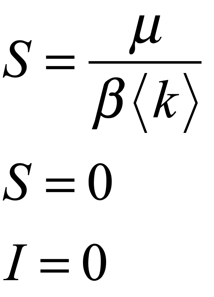
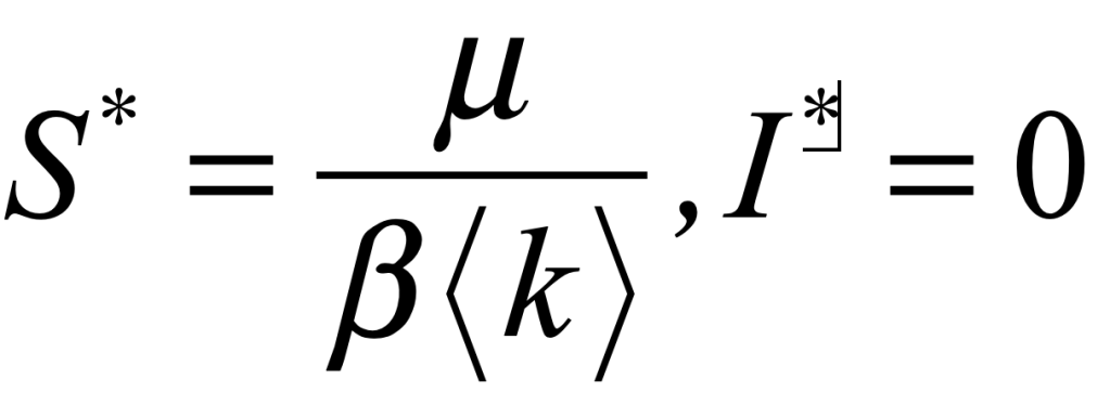
The SIRS model has the same bifurcation threshold as the SIS model that was discussed in a previous blog. If the infection rate can be made slower than the recovery rate, then the pandemic can be eliminated entirely. The threshold is

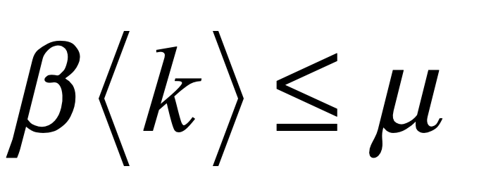
The parameter μ, the recovery rate, is intrinsic and cannot be changed. The parameter β, the infection rate per contact, can be reduced by personal hygiene and wearing masks. The parameter <k>, the average number of contacts to a susceptible person, can be significantly reduced by vaccinating a large fraction of the population.

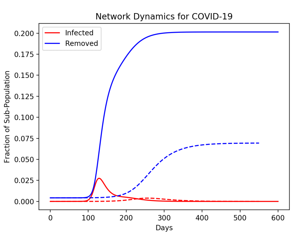
To simulate the effect of vaccination, the average <k> per person can be reduced at the time of vaccination. This lowers the average infection rate. The results are shown in Fig. 2 for the original dynamics, a vaccination of 20% of the populace, and a vaccination of 40% of the populace. For 20% vaccination, the epidemic is still above threshold, although the long-time infection is lower. For 40% of the population vaccinated, the disease falls below threshold and would decay away and vanish.

Fig. 2 Vaccination at 52 weeks can lower the infection cases (20% vaccinated) or eliminate them entirely (40% vaccinated). The vaccinations would need booster shots every year (if the decay time of immunity is one year).

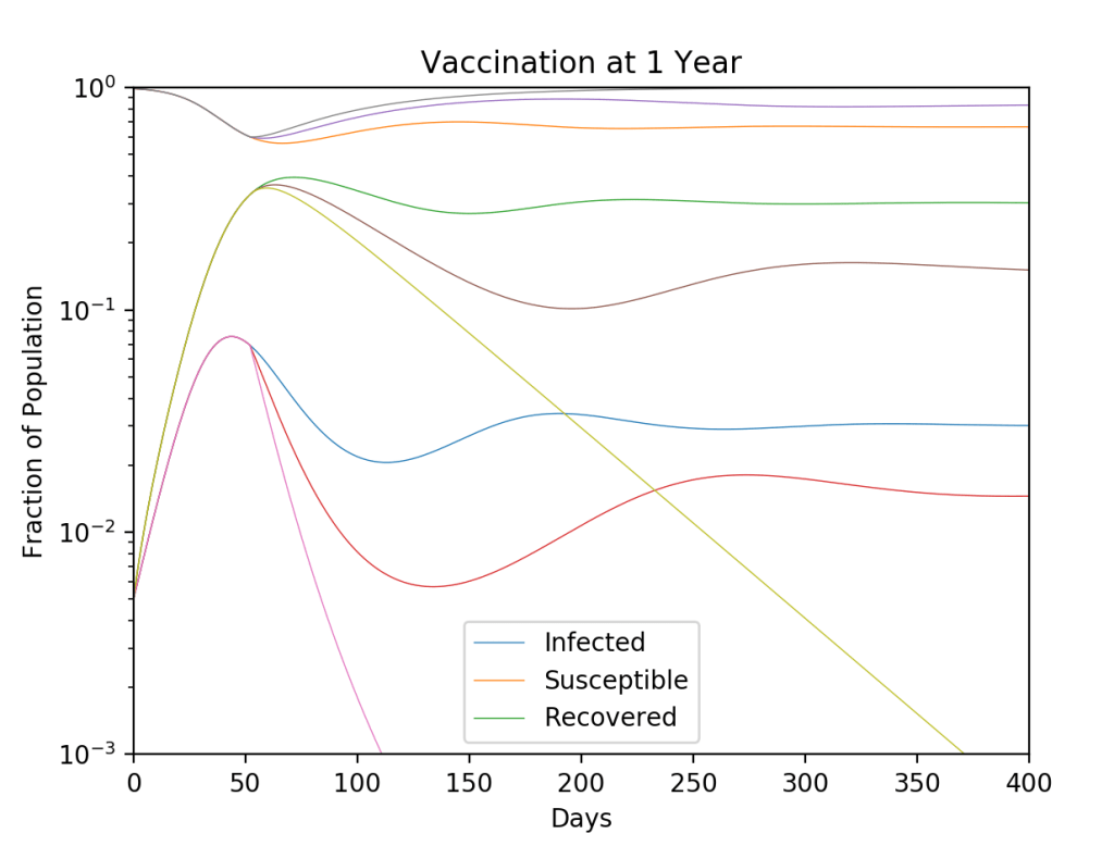
In this model, the vaccination is assumed to decay at the same rate as naturally acquired immunity (one year), so booster shots would be needed every year. Getting 40% of the population to get vaccinated may be achieved. Roughly that fraction get yearly flu shots in the US, so the COVID vaccine could be added to the list. But at 40% it would still be necessary for everyone to wear face masks and socially distance until the pandemic fades away. Interestingly, if the 40% got vaccinated all on the same date (across the world), then the pandemic would be gone in a few months. Unfortunately, that’s unrealistic, so with a world-wide push to get 40% of the World’s population vaccinated within five years, it would take that long to eliminate the disease, taking us to 2025 before we could go back to the way things were in November of 2019. But that would take a world-wide vaccination blitz the likes of which the world has never seen.

Python Code: SIRS.py

#!/usr/bin/env python3
# -*- coding: utf-8 -*-
"""
SIRS.py
Created on Fri July 17 2020
D. D. Nolte, "Introduction to Modern Dynamics: 
    Chaos, Networks, Space and Time, 2nd Edition (Oxford University Press, 2019)
@author: nolte
"""

import numpy as np
from scipy import integrate
from matplotlib import pyplot as plt

plt.close('all')

def tripartite(x,y,z):

    sm = x + y + z
    xp = x/sm
    yp = y/sm
    
    f = np.sqrt(3)/2
    
    y0 = f*xp
    x0 = -0.5*xp - yp + 1;
    
    lines = plt.plot(x0,y0)
    plt.setp(lines, linewidth=0.5)
    plt.plot([0, 1],[0, 0],'k',linewidth=1)
    plt.plot([0, 0.5],[0, f],'k',linewidth=1)
    plt.plot([1, 0.5],[0, f],'k',linewidth=1)
    plt.show()
    
print(' ')
print('SIRS.py')

def solve_flow(param,max_time=1000.0):

    def flow_deriv(x_y,tspan,mu,betap,nu):
        x, y = x_y
        
        return [-mu*x + betap*x*(1-x-y),mu*x-nu*y]
    
    x0 = [del1, del2]
    
    # Solve for the trajectories
    t = np.linspace(0, int(tlim), int(250*tlim))
    x_t = integrate.odeint(flow_deriv, x0, t, param)

    return t, x_t

 # rates per week
betap = 0.3;   # infection rate
mu = 0.2;      # recovery rate
nu = 0.02      # immunity decay rate

print('beta = ',betap)
print('mu = ',mu)
print('nu =',nu)
print('betap/mu = ',betap/mu)
          
del1 = 0.005         # initial infected
del2 = 0.005         # recovered

tlim = 600          # weeks (about 12 years)

param = (mu, betap, nu)    # flow parameters

t, y = solve_flow(param)
I = y[:,0]
R = y[:,1]
S = 1 - I - R

plt.figure(1)
lines = plt.semilogy(t,I,t,S,t,R)
plt.ylim([0.001,1])
plt.xlim([0,tlim])
plt.legend(('Infected','Susceptible','Recovered'))
plt.setp(lines, linewidth=0.5)
plt.xlabel('Days')
plt.ylabel('Fraction of Population')
plt.title('Population Dynamics for COVID-19')
plt.show()

plt.figure(2)
plt.hold(True)
for xloop in range(0,10):
    del1 = xloop/10.1 + 0.001
    del2 = 0.01

    tlim = 300
    param = (mu, betap, nu)    # flow parameters
    t, y = solve_flow(param)       
    I = y[:,0]
    R = y[:,1]
    S = 1 - I - R
    
    tripartite(I,R,S);

for yloop in range(1,6):
    del1 = 0.001;
    del2 = yloop/10.1
    t, y = solve_flow(param)
    I = y[:,0]
    R = y[:,1]
    S = 1 - I - R
    
    tripartite(I,R,S);
    
for loop in range(2,10):
    del1 = loop/10.1
    del2 = 1 - del1 - 0.01
    t, y = solve_flow(param)
    I = y[:,0]
    R = y[:,1]
    S = 1 - I - R
        
    tripartite(I,R,S);
    
plt.hold(False)
plt.title('Simplex Plot of COVID-19 Pop Dynamics')
 
vac = [1, 0.8, 0.6]
for loop in vac:
               
    # Run the epidemic to the first peak
    del1 = 0.005
    del2 = 0.005
    tlim = 52
    param = (mu, betap, nu)
    t1, y1 = solve_flow(param)
    
    # Now vaccinate a fraction of the population
    st = np.size(t1)
    del1 = y1[st-1,0]
    del2 = y1[st-1,1]
    tlim = 400
    
    param = (mu, loop*betap, nu)
    t2, y2 = solve_flow(param)
    
    t2 = t2 + t1[st-1]
    
    tc = np.concatenate((t1,t2))
    yc = np.concatenate((y1,y2))
    
    I = yc[:,0]
    R = yc[:,1]
    S = 1 - I - R
    
    plt.figure(3)
    plt.hold(True)
    lines = plt.semilogy(tc,I,tc,S,tc,R)
    plt.ylim([0.001,1])
    plt.xlim([0,tlim])
    plt.legend(('Infected','Susceptible','Recovered'))
    plt.setp(lines, linewidth=0.5)
    plt.xlabel('Weeks')
    plt.ylabel('Fraction of Population')
    plt.title('Vaccination at 1 Year')
    plt.show()
    
plt.hold(False)

Caveats and Disclaimers

No effort was made to match parameters to the actual properties of the COVID-19 pandemic. The SIRS model is extremely simplistic and can only show general trends because it homogenizes away all the important spatial heterogeneity of the disease across the cities and states of the country. If you live in a hot spot, this model says little about what you will experience locally. The decay of immunity is also a completely open question and the decay rate is completely unknown. It is easy to modify the Python program to explore the effects of differing decay rates and vaccination fractions. The model also can be viewed as a “compartment” to model local variations in parameters.

Physics in the Age of Contagion. Part 3: Testing and Tracing COVID-19

In the midst of this COVID crisis (and the often botched governmental responses to it), there have been several success stories: Taiwan, South Korea, Australia and New Zealand stand out. What are the secrets to their success? First, is the willingness of the population to accept the seriousness of the pandemic and to act accordingly. Second, is a rapid and coherent (and competent) governmental response. Third, is biotechnology and the physics of ultra-sensitive biomolecule detection.

Antibody Testing

A virus consists a protein package called a capsid that surrounds polymers of coding RNA. Protein molecules on the capsid are specific to the virus and are the key to testing whether a person has been exposed to the virus. These specific molecules are called antigens, and the body produces antibodies — large biomolecules — that are rapidly evolved by the immune system and released into the blood system to recognize and bind to the antigen. The recognition and binding is highly specific (though not perfect) to the capsid proteins of the virus, so that other types of antibodies (produced to fend off other infections) tend not to bind to it. This specificity enables antibody testing.

In principle, all one needs to do is isolate the COVID-19 antigen, bind it to a surface, and run a sample of a patient’s serum (the part of the blood without the blood cells) over the same surface. If the patient has produced antibodies against the COVID-19, these antibodies will attach to the antigens stuck to the surface. After washing away the rest of the serum, what remains are anti-COVID antibodies attached to the antigens bound to the surface. The next step is to determine whether these antibodies have been bound to the surface or not.

Fig. 1 Schematic of an antibody macromolecule. The total height of the molecule is about 3 nanometers. The antigen binding sites are at the ends of the upper arms.

At this stage, there are many possible alternative technologies to detecting the bound antibodies (see section below on the physics of the BioCD for one approach). A conventional detection approach is known as ELISA (Enzyme-linked immunosorbant assay). To detect the bound antibody, a secondary antibody that binds to human antibodies is added to the test well. This secondary antibody contains either a fluorescent molecular tag or an enzyme that causes the color of the well to change (kind of like how a pregnancy test causes a piece of paper to change color). If the COVID antigen binds antibodies from the patient serum, then this second antibody will bind to the first and can be detected by fluorescence or by simple color change.

The technical challenges associated with antibody assays relate to false positives and false negatives. A false positive happens when the serum is too sticky and some antibodies NOT against COVID tend to stick to the surface of the test well. This is called non-specific binding. The secondary antibodies bind to these non-specifically-bound antibodies and a color change reports a detection, when in fact no COVID-specific antibodies were there. This is a false positive — the patient had not been exposed, but the test says they were.

On the other hand, a false negative occurs when the patient serum is possibly too dilute and even though anti-COVID antibodies are present, they don’t bind sufficiently to the test well to be detectable. This is a false negative — the patient had been exposed, but the test says they weren’t. Despite how mature antibody assay technology is, false positives and false negatives are very hard to eliminate. It is fairly common for false rates to be in the range of 5% to 10% even for high-quality immunoassays. The finite accuracy of the tests must be considered when doing community planning for testing and tracking. But the bottom line is that even 90% accuracy on the test can do a lot to stop the spread of the infection. This is because of the geometry of social networks and how important it is to find and isolate the super spreaders.

Social Networks

The web of any complex set of communities and their interconnections aren’t just random. Whether in interpersonal networks, or networks of cities and states and nations, it’s like the world-wide-web where the most popular webpages get the most links. This is the same phenomenon that makes the rich richer and the poor poorer. It produces a network with a few hubs that have a large fraction of the links. A network model that captures this network topology is known as the Barabasi-Albert model for scale-free networks [1]. A scale-free network tends to have one node that has the most links, then a couple of nodes that have a little fewer links, then several more with even fewer, and so on, until there are a vary large number of nodes with just a single link each.

When it comes to pandemics, this type of network topology is both a curse and a blessing. It is a curse, because if the popular node becomes infected it tends to infect a large fraction of the rest of the network because it is so linked in. But it is a blessing, because if that node can be identified and isolated from the rest of the network, then the chance of the pandemic sweeping across the whole network can be significantly reduced. This is where testing and contact tracing becomes so important. You have to know who is infected and who they are connected with. Only then can you isolate the central nodes of the network and make a dent in the pandemic spread.

An example of a Barabasi-Albert network is shown in Fig. 2 having 128 nodes. Some nodes have many links out (and in) the number of links connecting a node is called the node degree. There are several nodes of very high degree (a degree around 25 in this case) but also very many nodes that have only a single link. It’s the high-degree nodes that matter in a pandemic. If they get infected, then they infect almost the entire network. This scale-free network structure emphasizes the formation of central high-degree nodes. It tends to hold for many social networks, but also can stand for cities across a nation. A city like New York has links all over the country (by flights), while my little town of Lafayette IN might be modeled by a single link to Indianapolis. That same scaling structure is seen across many scales from interactions among nations to interactions among citizens in towns.

Fig. 2 A scale-free network with 128 nodes. A few nodes have high degree, but most nodes have a degree of one.

Isolating the Super Spreaders

In the network of nodes in Fig. 2, each node can be considered as a “compartment” in a multi-compartment SIR model (see my previous blog for the two-compartment SIR model of COVID-19). The infection of each node depends on the SIR dynamics of that node, plus the infections coming in from links other infected nodes. The equations of the dynamics for each node are

where Aab is the adjacency matrix where self-connection is allowed (infection dynamics within a node) and the sums go over all the nodes of the network. In this model, the population of each node is set equal to the degree ka of the node. The spread of the pandemic across the network depends on the links and where the infection begins, but the overall infection is similar to the simple SIR model for a given average network degree

However, if the pandemic starts, but then the highest-degree node (the super spreader) is isolated (by testing and contact tracing), then the saturation of the disease across the network can be decreased in a much greater proportion than simply given by the population of the isolated node. For instance, in the simulation in Fig. 3, a node of degree 20 is removed at 50 days. The fraction of the population that is isolated is only 10%, yet the saturation of the disease across the whole network is decreased by more than a factor of 2.

Fig. 3 Scale-free network of 128 nodes. Solid curve is infection dynamics of the full network. Dashed curve is the infection when the highest-degree node was isolated at 50 days.

In a more realistic model with many more nodes, and full testing to allow the infected nodes and their connections to be isolated, the disease can be virtually halted. This is what was achieved in Taiwan and South Korea. The question is why the United States, with its technologically powerful companies and all their capabilities, was so unprepared or unwilling to achieve the same thing.

Python Code: NetSIRSF.py

#!/usr/bin/env python3
# -*- coding: utf-8 -*-
"""
NetSIRSF.py
Created on Sat May 11 08:56:41 2019
@author: nolte
D. D. Nolte, Introduction to Modern Dynamics: Chaos, Networks, Space and Time, 2nd ed. (Oxford,2019)
"""

# https://www.python-course.eu/networkx.php
# https://networkx.github.io/documentation/stable/tutorial.html
# https://networkx.github.io/documentation/stable/reference/functions.html

import numpy as np
from scipy import integrate
from matplotlib import pyplot as plt
import networkx as nx
import time
from random import random

tstart = time.time()

plt.close('all')

betap = 0.014;
mu = 0.13;

print('beta = ',betap)
print('betap/mu = ',betap/mu)


N = 128      # 50


facoef = 2
k = 1
nodecouple = nx.barabasi_albert_graph(N, k, seed=None)

indhi = 0
deg = 0
for omloop in nodecouple.node:
    degtmp = nodecouple.degree(omloop)
    if degtmp > deg:
        deg = degtmp
        indhi = omloop
print('highest degree node = ',indhi)
print('highest degree = ',deg)

plt.figure(1)
colors = [(random(), random(), random()) for _i in range(10)]
nx.draw_circular(nodecouple,node_size=75, node_color=colors)
print(nx.info(nodecouple))
        
# function: omegout, yout = coupleN(G)
def coupleN(G,tlim):

    # function: yd = flow_deriv(x_y)
    def flow_deriv(x_y,t0):
        
        N = np.int(x_y.size/2)
        yd = np.zeros(shape=(2*N,))
        ind = -1
        for omloop in G.node:
            ind = ind + 1
            temp1 = -mu*x_y[ind] + betap*x_y[ind]*x_y[N+ind]
            temp2 =  -betap*x_y[ind]*x_y[N+ind]
            linksz = G.node[omloop]['numlink']
            for cloop in range(linksz):
                cindex = G.node[omloop]['link'][cloop]
                indx = G.node[cindex]['index']
                g = G.node[omloop]['coupling'][cloop]
                
                temp1 = temp1 + g*betap*x_y[indx]*x_y[N+ind]
                temp2 = temp2 - g*betap*x_y[indx]*x_y[N+ind]
            
            yd[ind] = temp1
            yd[N+ind] = temp2
                
        return yd
    # end of function flow_deriv(x_y)
    x0 = x_y
    t = np.linspace(0,tlim,tlim)      # 600  300
    y = integrate.odeint(flow_deriv, x0, t)        
    
    return t,y
    # end of function: omegout, yout = coupleN(G)

lnk = np.zeros(shape = (N,), dtype=int)
ind = -1
for loop in nodecouple.node:
    ind = ind + 1
    nodecouple.node[loop]['index'] = ind
    nodecouple.node[loop]['link'] = list(nx.neighbors(nodecouple,loop))
    nodecouple.node[loop]['numlink'] = len(list(nx.neighbors(nodecouple,loop)))
    lnk[ind] = len(list(nx.neighbors(nodecouple,loop)))

gfac = 0.1

ind = -1
for nodeloop in nodecouple.node:
    ind = ind + 1
    nodecouple.node[nodeloop]['coupling'] = np.zeros(shape=(lnk[ind],))
    for linkloop in range (lnk[ind]):
        nodecouple.node[nodeloop]['coupling'][linkloop] = gfac*facoef
            
x_y = np.zeros(shape=(2*N,))   
for loop in nodecouple.node:
    x_y[loop]=0
    x_y[N+loop]=nodecouple.degree(loop)
    #x_y[N+loop]=1
x_y[N-1 ]= 0.01
x_y[2*N-1] = x_y[2*N-1] - 0.01
N0 = np.sum(x_y[N:2*N]) - x_y[indhi] - x_y[N+indhi]
print('N0 = ',N0)
     
tlim0 = 600
t0,yout0 = coupleN(nodecouple,tlim0)                           # Here is the subfunction call for the flow


plt.figure(2)
plt.yscale('log')
plt.gca().set_ylim(1e-3, 1)
for loop in range(N):
    lines1 = plt.plot(t0,yout0[:,loop])
    lines2 = plt.plot(t0,yout0[:,N+loop])
    lines3 = plt.plot(t0,N0-yout0[:,loop]-yout0[:,N+loop])

    plt.setp(lines1, linewidth=0.5)
    plt.setp(lines2, linewidth=0.5)
    plt.setp(lines3, linewidth=0.5)
    

Itot = np.sum(yout0[:,0:127],axis = 1) - yout0[:,indhi]
Stot = np.sum(yout0[:,128:255],axis = 1) - yout0[:,N+indhi]
Rtot = N0 - Itot - Stot
plt.figure(3)
#plt.plot(t0,Itot,'r',t0,Stot,'g',t0,Rtot,'b')
plt.plot(t0,Itot/N0,'r',t0,Rtot/N0,'b')
#plt.legend(('Infected','Susceptible','Removed'))
plt.legend(('Infected','Removed'))
plt.hold

# Repeat but innoculate highest-degree node
x_y = np.zeros(shape=(2*N,))   
for loop in nodecouple.node:
    x_y[loop]=0
    x_y[N+loop]=nodecouple.degree(loop)
    #x_y[N+loop]=1
x_y[N-1] = 0.01
x_y[2*N-1] = x_y[2*N-1] - 0.01
N0 = np.sum(x_y[N:2*N]) - x_y[indhi] - x_y[N+indhi]
     
tlim0 = 50
t0,yout0 = coupleN(nodecouple,tlim0)


# remove all edges from highest-degree node
ee = list(nodecouple.edges(indhi))
nodecouple.remove_edges_from(ee)
print(nx.info(nodecouple))

#nodecouple.remove_node(indhi)        
lnk = np.zeros(shape = (N,), dtype=int)
ind = -1
for loop in nodecouple.node:
    ind = ind + 1
    nodecouple.node[loop]['index'] = ind
    nodecouple.node[loop]['link'] = list(nx.neighbors(nodecouple,loop))
    nodecouple.node[loop]['numlink'] = len(list(nx.neighbors(nodecouple,loop)))
    lnk[ind] = len(list(nx.neighbors(nodecouple,loop)))

ind = -1
x_y = np.zeros(shape=(2*N,)) 
for nodeloop in nodecouple.node:
    ind = ind + 1
    nodecouple.node[nodeloop]['coupling'] = np.zeros(shape=(lnk[ind],))
    x_y[ind] = yout0[tlim0-1,nodeloop]
    x_y[N+ind] = yout0[tlim0-1,N+nodeloop]
    for linkloop in range (lnk[ind]):
        nodecouple.node[nodeloop]['coupling'][linkloop] = gfac*facoef

    
tlim1 = 500
t1,yout1 = coupleN(nodecouple,tlim1)

t = np.zeros(shape=(tlim0+tlim1,))
yout = np.zeros(shape=(tlim0+tlim1,2*N))
t[0:tlim0] = t0
t[tlim0:tlim1+tlim0] = tlim0+t1
yout[0:tlim0,:] = yout0
yout[tlim0:tlim1+tlim0,:] = yout1


plt.figure(4)
plt.yscale('log')
plt.gca().set_ylim(1e-3, 1)
for loop in range(N):
    lines1 = plt.plot(t,yout[:,loop])
    lines2 = plt.plot(t,yout[:,N+loop])
    lines3 = plt.plot(t,N0-yout[:,loop]-yout[:,N+loop])

    plt.setp(lines1, linewidth=0.5)
    plt.setp(lines2, linewidth=0.5)
    plt.setp(lines3, linewidth=0.5)
    

Itot = np.sum(yout[:,0:127],axis = 1) - yout[:,indhi]
Stot = np.sum(yout[:,128:255],axis = 1) - yout[:,N+indhi]
Rtot = N0 - Itot - Stot
plt.figure(3)
#plt.plot(t,Itot,'r',t,Stot,'g',t,Rtot,'b',linestyle='dashed')
plt.plot(t,Itot/N0,'r',t,Rtot/N0,'b',linestyle='dashed')
#plt.legend(('Infected','Susceptible','Removed'))
plt.legend(('Infected','Removed'))
plt.xlabel('Days')
plt.ylabel('Fraction of Sub-Population')
plt.title('Network Dynamics for COVID-19')
plt.show()
plt.hold()

elapsed_time = time.time() - tstart
print('elapsed time = ',format(elapsed_time,'.2f'),'secs')

Caveats and Disclaimers

No effort in the network model was made to fit actual disease statistics. In addition, the network in Figs. 2 and 3 only has 128 nodes, and each node was a “compartment” that had its own SIR dynamics. This is a coarse-graining approach that would need to be significantly improved to try to model an actual network of connections across communities and states. In addition, isolating the super spreader in this model would be like isolating a city rather than an individual, which is not realistic. The value of a heuristic model is to gain a physical intuition about scales and behaviors without being distracted by details of the model.

Postscript: Physics of the BioCD

Because antibody testing has become such a point of public discussion, it brings to mind a chapter of my own life that was closely related to this topic. About 20 years ago my research group invented and developed an antibody assay called the BioCD [2]. The “CD” stood for “compact disc”, and it was a spinning-disk format that used laser interferometry to perform fast and sensitive measurements of antibodies in blood. We launched a start-up company called QuadraSpec in 2004 to commercialize the technology for large-scale human disease screening.

A conventional compact disc consists of about a billion individual nulling interferometers impressed as pits into plastic. When the read-out laser beam straddles one of the billion pits, it experiences a condition of perfect destructive interferences — a zero. But when it was not shining on a pit it experiences high reflection — a one. So as the laser scans across the surface of the disc as it spins, a series of high and low reflections read off bits of information. Because the disc spins very fast, the data rate is very high, and a billion bits can be read in a matter of minutes.

The idea struck me in late 1999 just before getting on a plane to spend a weekend in New York City: What if each pit were like a test tube, so that instead of reading bits of ones and zeros it could read tiny amounts of protein? Then instead of a billion ones and zeros the disc could read a billion protein concentrations. But nulling interferometers are the least sensitive way to measure something sensitively because it operates at a local minimum in the response curve. The most sensitive way to do interferometry is in the condition of phase quadrature when the signal and reference waves are ninety-degrees out of phase and where the response curve is steepest, as in Fig. 4 . Therefore, the only thing you need to turn a compact disc from reading ones and zeros to proteins is to reduce the height of the pit by half. In practice we used raised ridges of gold instead of pits, but it worked in the same way and was extremely sensitive to the attachment of small amounts of protein.

Fig. 4 Principle of the BioCD antibody assay. Reprinted from Ref. [3]

This first generation BioCD was literally a work of art. It was composed of a radial array of gold strips deposited on a silicon wafer. We were approached in 2004 by an art installation called “Massive Change” that was curated by the Vancouver Art Museum. The art installation travelled to Toronto and then to the Museum of Contemporary Art in Chicago, where we went to see it. Our gold-and-silicon BioCD was on display in a section on art in technology.

The next-gen BioCDs were much simpler, consisting simply of oxide layers on silicon wafers, but they were much more versatile and more sensitive. An optical scan of a printed antibody spot on a BioCD is shown in Fig. 5 The protein height is only about 1 nanometer (the diameter of the spot is 100 microns). Interferometry can measure a change in the height of the spot (caused by binding antibodies from patient serum) by only about 10 picometers averaged over the size of the spot. This exquisite sensitivity enabled us to detect tiny fractions of blood-born antigens and antibodies at the level of only a nanogram per milliliter.

Fig. 5 Interferometric measurement of a printed antibody spot on a BioCD. The spot height is about 1 nanomater and the diameter is about 100 microns. Interferometry can measure a change of height by about 10 picometers averaged over the spot.

The real estate on a 100 mm diameter disc was sufficient to do 100,000 antibody assays, which would be 256 protein targets across 512 patients on a single BioCD that would take only a few hours to finish reading!

Fig. 6 A single BioCD has the potential to measure hundreds of proteins or antibodies per patient with hundreds of patients per disc.

The potential of the BioCD for massively multiplexed protein measurements made it possible to imagine testing a single patient for hundreds of diseases in a matter of hours using only a few drops of blood. Furthermore, by being simple and cheap, the test would allow people to track their health over time to look for emerging health trends.

If this sounds familiar to you, you’re right. That’s exactly what the notorious company Theranos was promising investors 10 years after we first proposed this idea. But here’s the difference: We learned that the tech did not scale. It cost us $10M to develop a BioCD that could test for just 4 diseases. And it would cost more than an additional $10M to get it to 8 diseases, because the antibody chemistry is not linear. Each new disease that you try to test creates a combinatorics problem of non-specific binding with all the other antibodies and antigens. To scale the test up to 100 diseases on the single platform using only a few drops of blood would have cost us more than $1B of R&D expenses — if it was possible at all. So we stopped development at our 4-plex product and sold the technology to a veterinary testing company that uses it today to test for diseases like heart worm and Lymes disease in blood samples from pet animals.

Five years after we walked away from massively multiplexed antibody tests, Theranos proposed the same thing and took in more than $700M in US investment, but ultimately produced nothing that worked. The saga of Theranos and its charismatic CEO Elizabeth Holmes has been the topic of books and documentaries and movies like “The Inventor: Out for Blood in Silicon Valley” and a rumored big screen movie starring Jennifer Lawrence as Holmes.

The bottom line is that antibody testing is a difficult business, and ramping up rapidly to meet the demands of testing and tracing COVID-19 is going to be challenging. The key is not to demand too much accuracy per test. False positives are bad for the individual, because it lets them go about without immunity and they might get sick, and false negatives are bad, because it locks them in when they could be going about. But if an inexpensive test of only 90% accuracy (a level of accuracy that has already been called “unreliable” in some news reports) can be brought out in massive scale so that virtually everyone can be tested, and tested repeatedly, then the benefit to society would be great. In the scaling networks that tend to characterize human interactions, all it takes is a few high-degree nodes to be isolated to make infection rates plummet.

References

[1] A. L. Barabasi and R. Albert, “Emergence of scaling in random networks,” Science, vol. 286, no. 5439, pp. 509-512, Oct 15 (1999)

[2] D. D. Nolte, “Review of centrifugal microfluidic and bio-optical disks,” Review Of Scientific Instruments, vol. 80, no. 10, p. 101101, Oct (2009)

[3] D. D. Nolte and F. E. Regnier, “Spinning-Disk Interferometry: The BioCD,” Optics and Photonics News, no. October 2004, pp. 48-53, (2004)

Physics in the Age of Contagion. Part 2: The Second Wave of COVID-19

Since my last Blog on the bifurcation physics of COVID-19, most of the US has approached the crest of “the wave”, with the crest arriving sooner in hot spots like New York City and a few weeks later in rural areas like Lafayette, Indiana where I live. As of the posting of this Blog, most of the US is in lock-down with only a few hold-out states. Fortunately, this was sufficient to avoid the worst case scenarios of my last Blog, but we are still facing severe challenges.

There is good news! The second wave can be managed and minimized if we don’t come out of lock-down too soon.

One fall-out of the (absolutely necessary) lock-down is the serious damage done to the economy that is now in its greatest retraction since the Great Depression. The longer the lock-down goes, the deeper the damage and the longer to recover. The single-most important question at this point in time, as we approach the crest, is when we can emerge from lock down? This is a critical question. If we emerge too early, then the pandemic will re-kindle into a second wave that could exceed the first. But if we emerge later than necessary, then the economy may take a decade to fully recover. We need a Goldilocks solution: not too early and not too late. How do we assess that?

The Value of Qualitative Physics

In my previous Blog I laid out a very simple model called the Susceptible-Infected-Removed (SIR) model and provided a Python program whose parameters can be tweaked to explore the qualitatitive behavior of the model, answering questions like: What is the effect of longer or shorter quarantine periods? What role does social distancing play in saving lives? What happens if only a small fraction of the population pays attention and practice social distancing?

It is necessary to wait from releasing the lock-down at least several weeks after the crest has passed to avoid the second wave.

It is important to note that none of the parameters in that SIR model are reliable and no attempt was made to fit the parameters to the actual data. To expert epidemiological modelers, this simplistic model is less than useless and potentially dangerous if wrong conclusions are arrived at and disseminated on the internet.

But here is the point: The actual numbers are less important than the functional dependences. What matters is how the solution changes as a parameter is changed. The Python programs allow non-experts to gain an intuitive understanding of the qualitative physics of the pandemic. For instance, it is valuable to gain a feeling of how sensitive the pandemic is to small changes in parameters. This is especially important because of the bifurcation physics of COVID-19 where very small changes can cause very different trajectories of the population dynamics.

In the spirit of the value of qualitative physics, I am extending here that simple SIR model to a slightly more sophisticated model that can help us understand the issues and parametric dependences of this question of when to emerge from lock-down. Again, no effort is made to fit actual data of this pandemic, but there are still important qualitative conclusions to be made.

The Two-Compartment SIR Model of COVID-19

To approach a qualitative understanding of what happens by varying the length of time of the country-wide shelter-in-place, it helps to think of two cohorts of the public: those who are compliant and conscientious valuing the lives of others, and those who don’t care and are non-compliant.

Fig. 1 Two-compartment SIR model for compliant and non-compliant cohorts.

These two cohorts can each be modeled separately by their own homogeneous SIR models, but with a coupling between them because even those who shelter in place must go out for food and medicines. The equations of this two-compartment model are

where n and q refer to the non-compliant and the compliant cohorts, respectively. I and S are the susceptible populations. The coupling parameters are knn for the coupling between non-compliants individuals, knq for the effect of the compliant individuals on the non-compliant, kqn for the effect of the non-compliant individuals on the compliant, and kqq for the effect of the compliant cohort on themselves.

There are two time frames for the model. The first time frame is the time of lock-down when the compliant cohort is sheltering in place and practicing good hygiene, but they still need to go out for food and medicines. (This model does not include the first responders. They are an important cohort, but do not make up a large fraction of the national population). The second time frame is after the lock-down is removed. Even then, good practices by the compliant group are expected to continue with the purpose to lower infections among themselves and among others.

This two-compartment model has roughly 8 adjustable parameters, all of which can be varied to study their effects on the predictions. None of them are well known, but general trends still can be explored.

Python Code: SIRWave.py

#!/usr/bin/env python3
# -*- coding: utf-8 -*-
"""
SIRWave.py
Created on Sat March 21 2020
@author: nolte
D. D. Nolte, Introduction to Modern Dynamics: Chaos, Networks, Space and Time, 2nd ed. (Oxford,2019)
"""

import numpy as np
from scipy import integrate
from matplotlib import pyplot as plt

plt.close('all')

print(' ')
print('SIRWave.py')

def solve_flow(param,max_time=1000.0):

    def flow_deriv(x_y_z_w,tspan):
        In, Sn, Iq, Sq = x_y_z_w
        
        Inp = -mu*In + beta*knn*In*Sn + beta*knq*Iq*Sn
        Snp = -beta*knn*In*Sn - beta*knq*Iq*Sn
        
        Iqp = -mu*Iq + beta*kqn*In*Sq + beta*kqq*Iq*Sq
        Sqp = -beta*kqn*In*Sq - beta*kqq*Iq*Sq
        
        return [Inp, Snp, Iqp, Sqp]
    
    x0 = [In0, Sn0, Iq0, Sq0]
    
    # Solve for the trajectories
    t = np.linspace(tlo, thi, thi-tlo)
    x_t = integrate.odeint(flow_deriv, x0, t)

    return t, x_t

beta = 0.02   # infection rate
dill = 5      # mean days infectious
mu = 1/dill   # decay rate
fnq = 0.3     # fraction not quarantining
fq = 1-fnq    # fraction quarantining
P = 330       # Population of the US in millions
mr = 0.002    # Mortality rate
dq = 90       # Days of lock-down (this is the key parameter)

# During quarantine
knn = 50      # Average connections per day for non-compliant group among themselves
kqq = 0       # Connections among compliant group
knq = 0       # Effect of compliaht group on non-compliant
kqn = 5       # Effect of non-clmpliant group on compliant

initfrac = 0.0001          # Initial conditions:
In0 = initfrac*fnq         # infected non-compliant
Sn0 = (1-initfrac)*fnq     # susceptible non-compliant
Iq0 = initfrac*fq          # infected compliant
Sq0 = (1-initfrac)*fq      # susceptivle compliant

tlo = 0
thi = dq

param = (mu, beta, knn, knq, kqn, kqq)    # flow parameters

t1, y1 = solve_flow(param)

In1 = y1[:,0]
Sn1 = y1[:,1]
Rn1 = fnq - In1 - Sn1
Iq1 = y1[:,2]
Sq1 = y1[:,3]
Rq1 = fq - Iq1 - Sq1

# Lift the quarantine: Compliant group continues social distancing
knn = 50      # Adjusted coupling parameters
kqq = 5
knq = 20
kqn = 15

fin1 = len(t1)
In0 = In1[fin1-1]
Sn0 = Sn1[fin1-1]
Iq0 = Iq1[fin1-1]
Sq0 = Sq1[fin1-1]

tlo = fin1
thi = fin1 + 365-dq

param = (mu, beta, knn, knq, kqn, kqq)

t2, y2 = solve_flow(param)

In2 = y2[:,0]
Sn2 = y2[:,1]
Rn2 = fnq - In2 - Sn2
Iq2 = y2[:,2]
Sq2 = y2[:,3]
Rq2 = fq - Iq2 - Sq2

fin2 = len(t2)
t = np.zeros(shape=(fin1+fin2,))
In = np.zeros(shape=(fin1+fin2,))
Sn = np.zeros(shape=(fin1+fin2,))
Rn = np.zeros(shape=(fin1+fin2,))
Iq = np.zeros(shape=(fin1+fin2,))
Sq = np.zeros(shape=(fin1+fin2,))
Rq = np.zeros(shape=(fin1+fin2,))

t[0:fin1] = t1
In[0:fin1] = In1
Sn[0:fin1] = Sn1
Rn[0:fin1] = Rn1
Iq[0:fin1] = Iq1
Sq[0:fin1] = Sq1
Rq[0:fin1] = Rq1

t[fin1:fin1+fin2] = t2
In[fin1:fin1+fin2] = In2
Sn[fin1:fin1+fin2] = Sn2
Rn[fin1:fin1+fin2] = Rn2
Iq[fin1:fin1+fin2] = Iq2
Sq[fin1:fin1+fin2] = Sq2
Rq[fin1:fin1+fin2] = Rq2

plt.figure(1)
lines = plt.semilogy(t,In,t,Iq,t,(In+Iq))
plt.ylim([0.0001,.1])
plt.xlim([0,thi])
plt.legend(('Non-compliant','Compliant','Total'))
plt.setp(lines, linewidth=0.5)
plt.xlabel('Days')
plt.ylabel('Infected')
plt.title('Infection Dynamics for COVID-19 in US')
plt.show()

plt.figure(2)
lines = plt.semilogy(t,Rn*P*mr,t,Rq*P*mr)
plt.ylim([0.001,1])
plt.xlim([0,thi])
plt.legend(('Non-compliant','Compliant'))
plt.setp(lines, linewidth=0.5)
plt.xlabel('Days')
plt.ylabel('Deaths')
plt.title('Total Deaths for COVID-19 in US')
plt.show()

D = P*mr*(Rn[fin1+fin2-1] + Rq[fin1+fin2-1])
print('Deaths = ',D)

plt.figure(3)
lines = plt.semilogy(t,In/fnq,t,Iq/fq)
plt.ylim([0.0001,.1])
plt.xlim([0,thi])
plt.legend(('Non-compliant','Compliant'))
plt.setp(lines, linewidth=0.5)
plt.xlabel('Days')
plt.ylabel('Fraction of Sub-Population')
plt.title('Population Dynamics for COVID-19 in US')
plt.show()

Trends

The obvious trend to explore is the effect of changing the quarantine period. Fig. 2 shows the results of a an early release from shelter-in-place compared to pushing the release date one month longer. The trends are:

  • If the lock-down is released early, the second wave can be larger than the first wave
  • If the lock-down is released early, the compliant cohort will be mostly susceptible and will have the majority of new cases
  • There are 40% more deaths when the lock-down is released early

If the lock-down is ended just after the crest, this is too early. It is necessary to wait at least several weeks after the crest has passed to avoid the second wave. There are almost 40% more deaths for the 90-day period than the 120-day period. In addition, for the case when the quarantine is stopped too early, the compliant cohort, since they are the larger fraction and are mostly susceptible, will suffer a worse number of new infections than the non-compliant group who put them at risk in the first place. In addition, the second wave for the compliant group would be worse than the first wave. This would be a travesty! But by pushing the quarantine out by just 1 additional month, the compliant group will suffer fewer total deaths than the non-compliant group. Most importantly, the second wave would be substantially smaller than the first wave for both cohorts.

Fig. 2 Comparison of 90-day quarantine versus 120-day quarantine for the compliant and non-compliant cohort of individuals . When the ban is lifted too soon, the second wave can be bigger than the first. This model assumes that 30% of the population are non-compliant and that the compliant group continues to practice social distancing.

The lesson from this simple model is simple: push the quarantine date out as far as the economy can allow! There is good news! The second wave can be managed and minimized if we don’t come out of lock-down too soon.

Caveats and Disclaimers

This model is purely qualitative and only has value for studying trends that depend on changing parameters. Absolute numbers are not meant to be taken too seriously. For instance, the total number of deaths in this model are about 2x larger than what we are hearing from Dr. Fauci of NIAID at this time, so this simple model overestimates fatalities. Also, it doesn’t matter whether the number of quarantine days should be 60, 90 or 120 … what matters is that an additional month makes a large difference in total number of deaths. If someone does want to model the best possible number of quarantine days — the Goldilocks solution — then they need to get their hands on a professional epidemiological model (or an actual epidemiologist). The model presented here is not appropriate for that purpose.

Note added in postscript on April 8: Since posting the original blog on April 6, Dr, Fauci announced that as many as 90% of individuals are practicing some form of social distancing. In addition, many infections are not being reported because of lack of testing, which means that the mortality rate is lower than thought. Therefore, I have changed the mortality rate and figures with numbers that better reflect the current situation (that is changing daily), but still without any attempt to fit the numerous other parameters.

Physics in the Age of Contagion: The Bifurcation of COVID-19

We are at War! That may sound like a cliche, but more people in the United States may die over the next year from COVID-19 than US soldiers have died in all the wars ever fought in US history. It is a war against an invasion by an alien species that has no remorse and gives no quarter. In this war, one of our gravest enemies, beyond the virus, is misinformation. The Internet floods our attention with half-baked half-truths. There may even be foreign powers that see this time of crisis as an opportunity to sow fear through disinformation to divide the country.

Because of the bifurcation physics of the SIR model of COVID-19, small changes in personal behavior (if everyone participates) can literally save Millions of lives!

At such times, physicists may be tapped to help the war effort. This is because physicists have unique skill sets that help us see through the distractions of details to get to the essence of the problem. Our solutions are often back-of-the-envelope, but that is their strength. We can see zeroth-order results stripped bare of all the obfuscating minutia.

One way physicists can help in this war is to shed light on how infections percolate through a population and to provide estimates on the numbers involved. Perhaps most importantly, we can highlight what actions ordinary citizens can take that best guard against the worst-case scenarios of the pandemic. The zeroth-oder solutions may not say anything new that the experts don’t already know, but it may help spread the word of why such simple actions as shelter-in-place may save millions of lives.

The SIR Model of Infection

One of the simplest models for infection is the so-called SIR model that stands for Susceptible-Infected-Removed. This model is an averaged model (or a mean-field model) that disregards the fundamental network structure of human interactions and considers only averages. The dynamical flow equations are very simple

where I is the infected fraction of the population, and S is the susceptible fraction of the population. The coefficient μ is the rate at which patients recover or die, <k> is the average number of “links” to others, and β is the infection probability per link per day. The total population fraction is give by the constraint

where R is the removed population, most of whom will be recovered, but some fraction will have passed away. The number of deaths is

where m is the mortality rate, and Rinf is the longterm removed fraction of the population after the infection has run its course.

The nullclines, the curves along which the time derivatives vanish, are

Where the first nullcline intersects the third nullcline is the only fixed point of this simple model

The phase space of the SIR flow is shown in Fig. 1 plotted as the infected fraction as a function of the susceptible fraction. The diagonal is the set of initial conditions where R = 0. Each initial condition on the diagonal produces a dynamical trajectory. The dashed trajectory that starts at (1,0) is the trajectory for a new disease infecting a fully susceptible population. The trajectories terminate on the I = 0 axis at long times when the infection dies out. In this model, there is always a fraction of the population who never get the disease, not through unusual immunity, but through sheer luck.

Fig. 1 Phase space of the SIR model. The single fixed point has “marginal” stability, but leads to a finite number of of the population who never are infected. The dashed trajectory is the trajectory of the infection starting with a single case. (Adapted from “Introduction to Modern Dynamics” (Oxford University Press, 2019))

The key to understanding the scale of the pandemic is the susceptible fraction at the fixed point S*. For the parameters chosen to plot Fig. 1, the value of S* is 1/4, or β<k> = 4μ. It is the high value of the infection rate β<k> relative to the decay rate of the infection μ that allows a large fraction of the population to become infected. As the infection rate gets smaller, the fixed point S* moves towards unity on the horizontal axis, and less of the population is infected.

As soon as S* exceeds unity, for the condition

then the infection cannot grow exponentially and will decay away without infecting an appreciable fraction of the population. This condition represents a bifurcation in the infection dynamics. It means that if the infection rate can be reduced below the recovery rate, then the pandemic fades away. (It is important to point out that the R0 of a network model (the number of people each infected person infects) is analogous to the inverse of S*. When R0 > 1 then the infection spreads, just as when S* < 1, and vice versa.)

This bifurcation condition makes the strategy for fighting the pandemic clear. The parameter μ is fixed by the virus and cannot be altered. But the infection probability per day per social link, β, can be reduced by clean hygiene:

  • Don’t shake hands
  • Wash your hands often and thoroughly
  • Don’t touch your face
  • Cover your cough or sneeze in your elbow
  • Wear disposable gloves
  • Wipe down touched surfaces with disinfectants

And the number of contacts per person, <k>, can be reduced by social distancing:

  • No large gatherings
  • Stand away from others
  • Shelter-in-place
  • Self quarantine

The big question is: can the infection rate be reduced below the recovery rate through the actions of clean hygiene and social distancing? If there is a chance that it can, then literally millions of lives can be saved. So let’s take a look at COVID-19.

The COVID-19 Pandemic

To get a handle on modeling the COVID-19 pandemic using the (very simplistic) SIR model, one key parameter is the average number of people you are connected to, represented by <k>. These are not necessarily the people in your social network, but also includes people who may touch a surface you touched earlier, or who touched a surface you later touch yourself. It also includes anyone in your proximity who has coughed or sneezed in the past few minutes. The number of people in your network is a topic of keen current interest, but is surprisingly hard to pin down. For the sake of this model, I will take the number <k> = 50 as a nominal number. This is probably too small, but it is compensated by the probability of infection given by a factor r and by the number of days that an individual is infectious.

The spread is helped when infectious people go about their normal lives infecting others. But if a fraction of the population self quarantines, especially after they “may” have been exposed, then the effective number of infectious dinf days per person can be decreased. A rough equation that captures this is

where fnq is the fraction of the population that does NOT self quarantine, dill is the mean number of days a person is ill (and infectious), and dq is the number of days quarantined. This number of infectious days goes into the parameter β.

where r = 0.0002 infections per link per day2 , which is a very rough estimate of the coefficient for COVID-19.

It is clear why shelter-in-place can be so effective, especially if the number of days quarantined is equal to the number of days a person is ill. The infection could literally die out if enough people self quarantine by pushing the critical value S* above the bifurcation threshold. However, it is much more likely that large fractions of people will continue to move about. A simulation of the “wave” that passes through the US is shown in Fig. 2 (see the Python code in the section below for parameters). In this example, 60% of the population does NOT self quarantine. The wave peaks approximately 150 days after the establishment of community spread.

Fig. 2 Population dynamics for the US spread of COVID-19. The fraction that is infected represents a “wave” that passes through a community. In this simulation fnq = 60%. The total US dead after the wave has passed is roughly 2 Million in this simulation.

In addition to shelter-in-place, social distancing can have a strong effect on the disease spread. Fig. 3 shows the number of US deaths as a function of the fraction of the population who do NOT self-quarantine for a series of average connections <k>. The bifurcation effect is clear in this graph. For instance, if <k> = 50 is a nominal value, then if 85% of the population would shelter-in-place for 14 days, then the disease would fall below threshold and only a small number of deaths would occur. But if that connection number can be dropped even to <k> = 40, then only 60% would need to shelter-in-place to avoid the pandemic. By contrast, if 80% of the people don’t self-quarantine, and if <k> = 40, then there could be 2 Million deaths in the US by the time the disease has run its course.

Because of the bifurcation physics of this SIR model of COVID-19, small changes in personal behavior (if everyone participates) can literally save Millions of lives!

Fig. 3 Bifurcation plot of the number of US deaths as a function of the fraction of the population who do NOT shelter-in-place for different average links per person. At 20 links per person, the contagion could be contained. However, at 60 links per person, nearly 90% of the population would need to quarantine for at least 14 days to stop the spread.

There has been a lot said about “flattening the curve”, which is shown in Fig. 4. There are two ways that flattening the curve saves overall lives: 1) it keeps the numbers below the threshold capacity of hospitals; and 2) it decreases the total number infected and hence decreases the total dead. When the number of critical patients exceeds hospital capacity, the mortality rate increases. This is being seen in Italy where the hospitals have been overwhelmed and the mortality rate has risen from a baseline of 1% or 2% to as large as 8%. Flattening the curve is achieved by sheltering in place, personal hygiene and other forms of social distancing. The figure shows a family of curves for different fractions of the total population who shelter in place for 14 days. If more than 70% of the population shelters in place for 14 days, then the curve not only flattens … it disappears!

Fig. 4 Flattening the curve for a range of fractions of the population that shelters in place for 14 days. (See Python code for parameters.)

Python Code: SIR.py

#!/usr/bin/env python3
# -*- coding: utf-8 -*-
"""
SIR.py
Created on Sat March 21 2020
@author: nolte
D. D. Nolte, Introduction to Modern Dynamics: Chaos, Networks, Space and Time, 2nd ed. (Oxford,2019)
"""

import numpy as np
from scipy import integrate
from matplotlib import pyplot as plt

plt.close('all')

print(' ')
print('SIR.py')

def solve_flow(param,max_time=1000.0):

    def flow_deriv(x_y,tspan,mu,betap):
        x, y = x_y
        
        return [-mu*x + betap*x*y,-betap*x*y]
    
    x0 = [del1, del2]
    
    # Solve for the trajectories
    t = np.linspace(0, int(tlim), int(250*tlim))
    x_t = integrate.odeint(flow_deriv, x0, t, param)

   
    return t, x_t


r = 0.0002    # 0.0002
k = 50        # connections  50
dill = 14     # days ill 14
dpq = 14      # days shelter in place 14
fnq = 0.6     # fraction NOT sheltering in place
mr0 = 0.01    # mortality rate
mr1 = 0.03     # extra mortality rate if exceeding hospital capacity
P = 330       # population of US in Millions
HC = 0.003    # hospital capacity

dinf = fnq*dill + (1-fnq)*np.exp(-dpq/dill)*dill;

betap = r*k*dinf;
mu = 1/dill;

print('beta = ',betap)
print('dinf = ',dinf)
print('beta/mu = ',betap/mu)
          
del1 = .001         # infected
del2 = 1-del1       # susceptible

tlim = np.log(P*1e6/del1)/betap + 50/betap

param = (mu, betap)    # flow parameters

t, y = solve_flow(param)
I = y[:,0]
S = y[:,1]
R = 1 - I - S

plt.figure(1)
lines = plt.semilogy(t,I,t,S,t,R)
plt.ylim([0.001,1])
plt.xlim([0,tlim])
plt.legend(('Infected','Susceptible','Removed'))
plt.setp(lines, linewidth=0.5)
plt.xlabel('Days')
plt.ylabel('Fraction of Population')
plt.title('Population Dynamics for COVID-19 in US')
plt.show()

mr = mr0 + mr1*(0.2*np.max(I)-HC)*np.heaviside(0.2*np.max(I),HC)
Dead = mr*P*R[R.size-1]
print('US Dead = ',Dead)

D = np.zeros(shape=(100,))
x = np.zeros(shape=(100,))
for kloop in range(0,5):
    for floop in range(0,100):
        
        fnq = floop/100
        
        dinf = fnq*dill + (1-fnq)*np.exp(-dpq/dill)*dill;
        
        k = 20 + kloop*10
        betap = r*k*dinf
        
        tlim = np.log(P*1e6/del1)/betap + 50/betap

        param = (mu, betap)    # flow parameters

        t, y = solve_flow(param)       
        I = y[:,0]
        S = y[:,1]
        R = 1 - I - S
        
        mr = mr0 + mr1*(0.2*np.max(I)-HC)*np.heaviside(0.2*np.max(I),HC)

        D[floop] = mr*P*R[R.size-1]
        x[floop] = fnq
        
    plt.figure(2)
    lines2 = plt.plot(x,D)
    plt.setp(lines2, linewidth=0.5)

plt.ylabel('US Million Deaths')
plt.xlabel('Fraction NOT Quarantining')
plt.title('Quarantine and Distancing')        
plt.legend(('20','30','40','50','60','70'))
plt.show()    


label = np.zeros(shape=(9,))
for floop in range(0,8):
    
    fq = floop/10.0
    
    dinf = (1-fq)*dill + fq*np.exp(-dpq/dill)*dill;
    
    k = 50
    betap = r*k*dinf
    
    tlim = np.log(P*1e6/del1)/betap + 50/betap

    param = (mu, betap)    # flow parameters

    t, y = solve_flow(param)       
    I = y[:,0]
    S = y[:,1]
    R = 1 - I - S
    
    plt.figure(3)
    lines2 = plt.plot(t,I*P)
    plt.setp(lines2, linewidth=0.5)
    label[floop]=fq

plt.legend(label)
plt.ylabel('US Millions Infected')
plt.xlabel('Days')
plt.title('Flattening the Curve')       

You can run this Python code yourself and explore the effects of changing the parameters. For instance, the mortality rate is modeled to increase when the number of hospital beds is exceeded by the number of critical patients. This coefficient is not well known and hence can be explored numerically. Also, the infection rate r is not known well, nor the average number of connections per person. The effect of longer quarantines can also be tested relative to the fraction who do not quarantine at all. Because of the bifurcation physics of the disease model, large changes in dynamics can occur for small changes in parameters when the dynamics are near the bifurcation threshold.

Caveats and Disclaimers

This SIR model of COVID-19 is an extremely rough tool that should not be taken too literally. It can be used to explore ideas about the general effect of days quarantined, or changes in the number of social contacts, but should not be confused with the professional models used by epidemiologists. In particular, this mean-field SIR model completely ignores the discrete network character of person-to-person spread. It also homogenizes the entire country, where is it blatantly obvious that the dynamics inside New York City are very different than the dynamics in rural Indiana. And the elimination of the epidemic, so that it would not come back, would require strict compliance for people to be tested (assuming there are enough test kits) and infected individuals to be isolated after the wave has passed.